Capsule Corporation
A rebrand of a fictional entity
Overview
Capsule Corporation is a fictional entity set in the Dragonball universe. The company's premier product is a technology that allows for the dynamic shrinkingnof any object/substance, for easy storage and carrying inside tiny capsules. The shrunken matter can be extracted to their original sizes later with the press of a button. This project will serve to not only refresh, but also to portray the company in a non-fictonal, modern setting. But probably just to feed my childhood fasciniation with Dragonball Z.
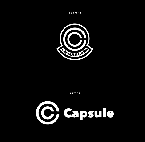
The Refresh
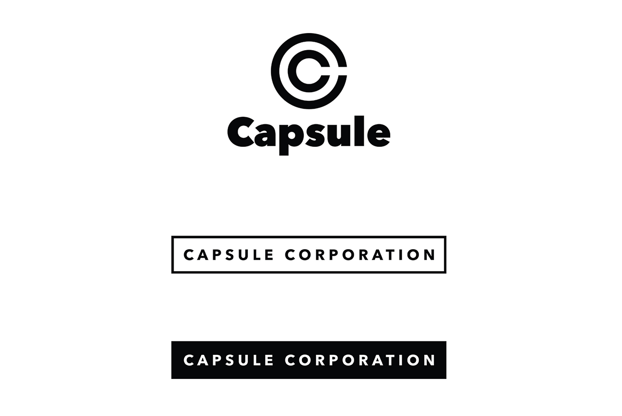
Since the original logomark and branding feels dated and typographically random, this rebrand will attempt at standardizing the assets of the brand through a complete rebrand.
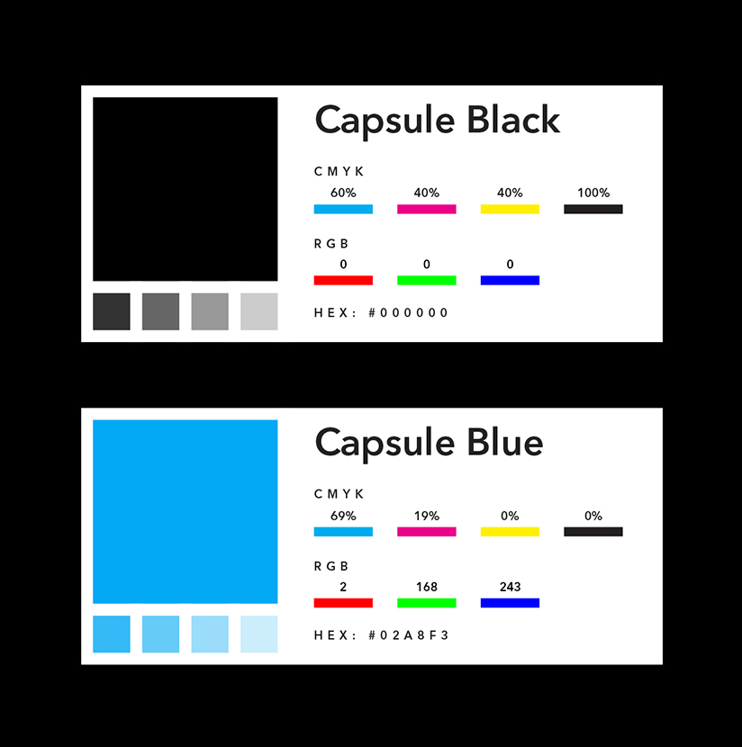
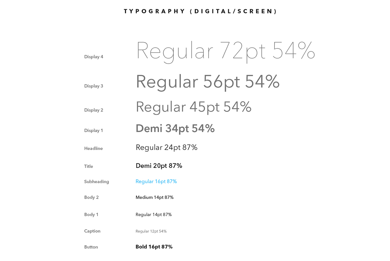
Standards for modern digital use were also made for the logo and typography, as seen below.

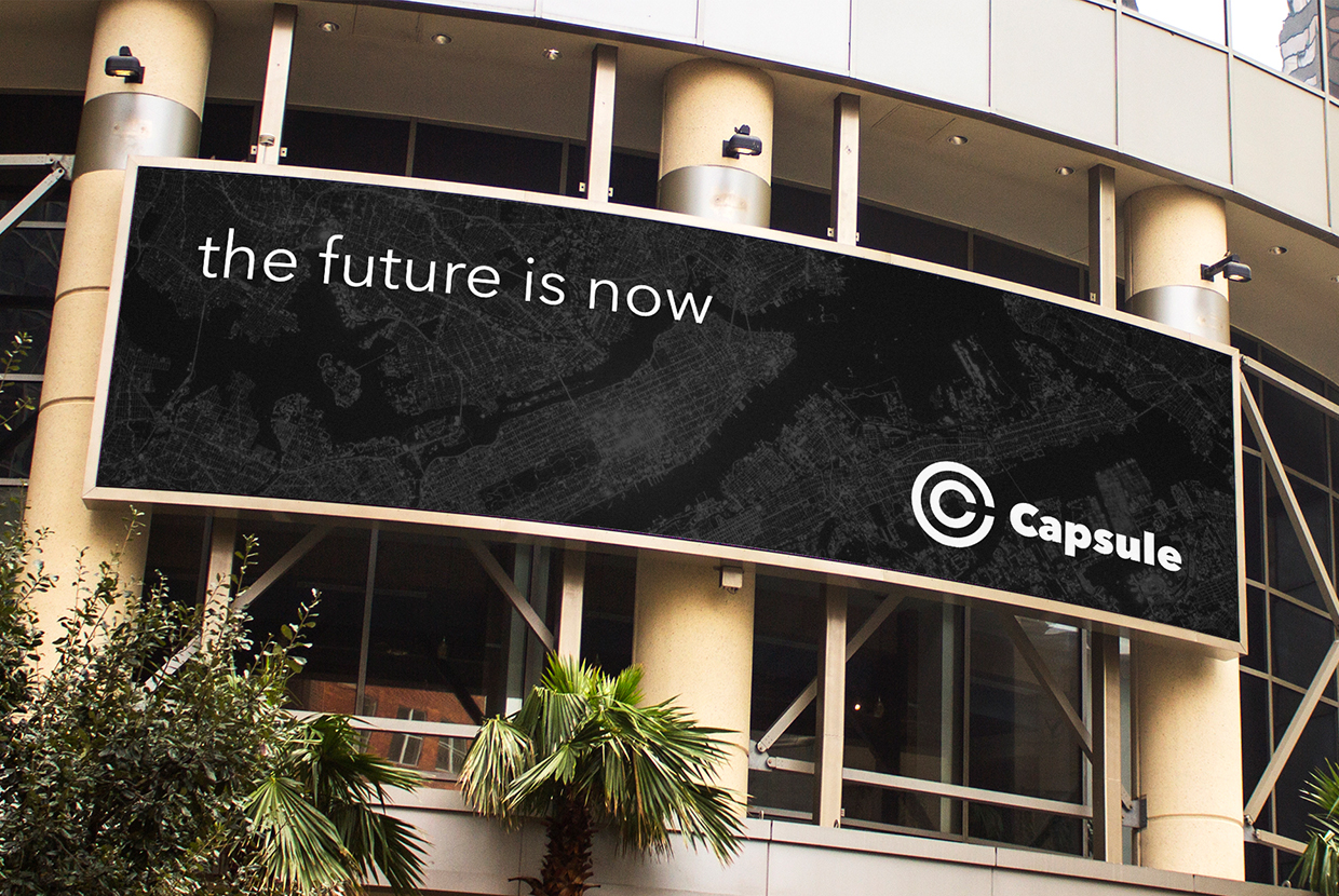
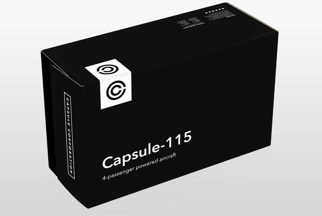
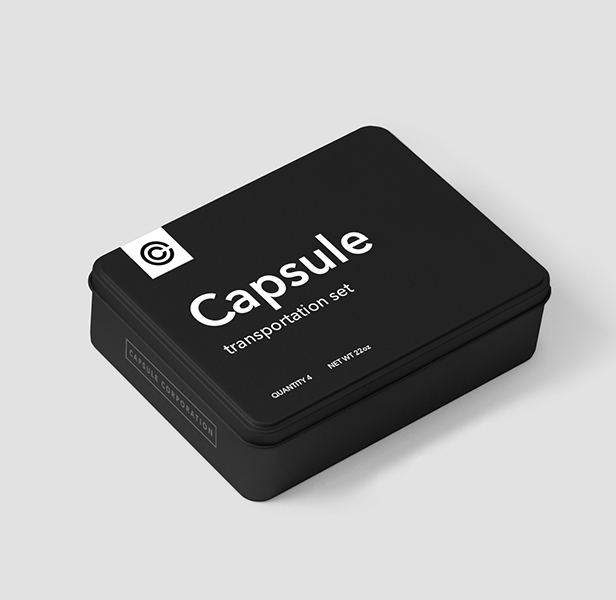
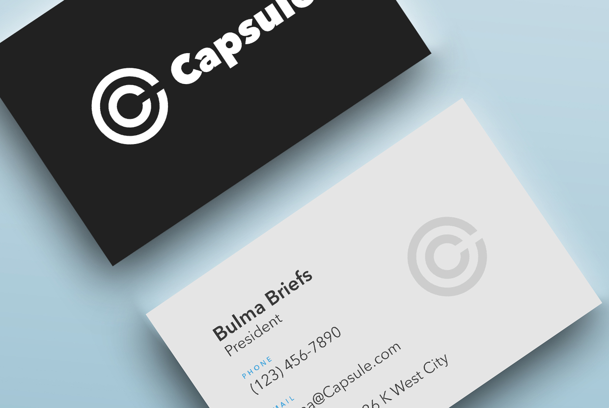
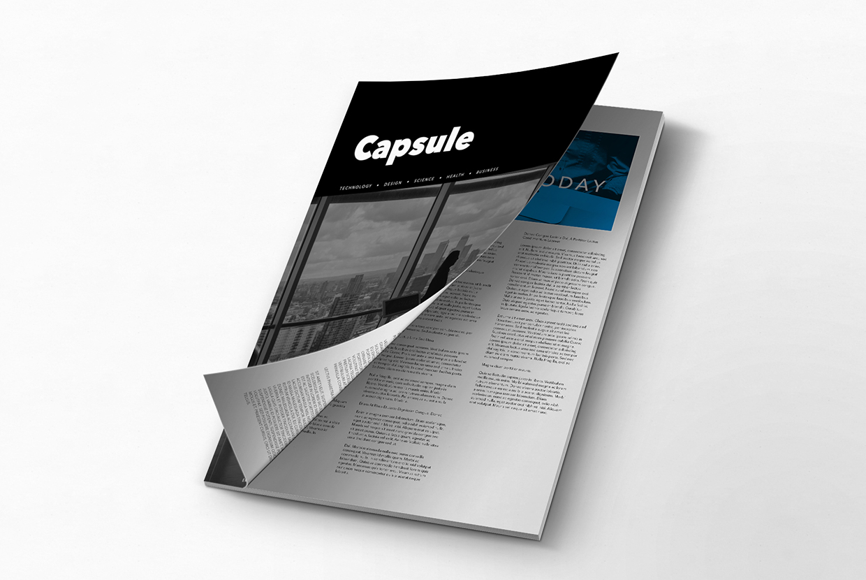
Print design
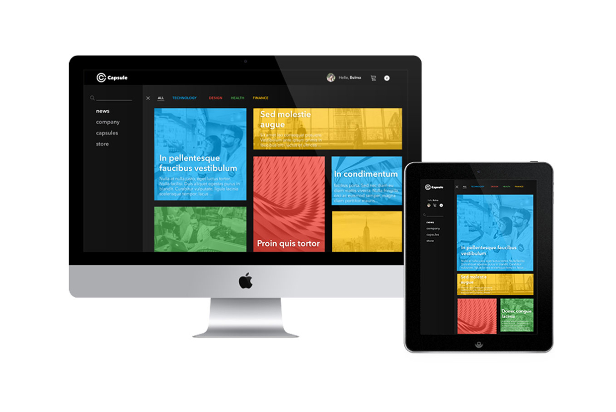
In a modern era, Capsule's visual brand might have a majority of its presence digitally, but the company's primary business is in its physical products.
Therefore, it's print design should follow the minimalistic, bold fundamentals, as seen in its digital brand presence

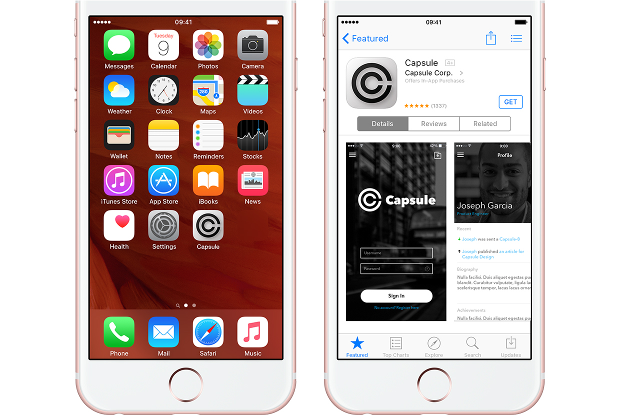
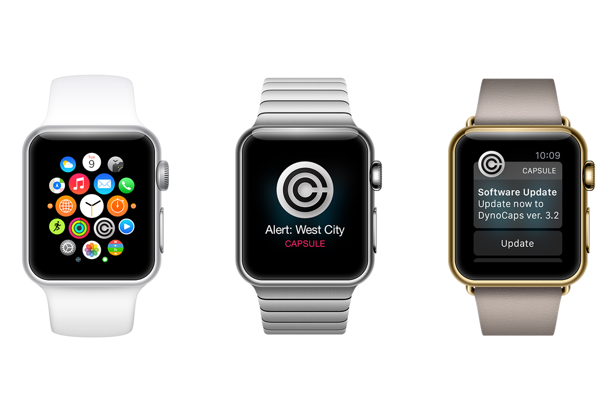
Mobile?
Many modern brands tether their presence to the user by use of mobile applications.
Shown are a few examples of how a fictional entity such as Capsule Corp. might do so in our world.